Editorial
Blush Pink Wallpaper: A Warm, Grown-Up Take
- #trends
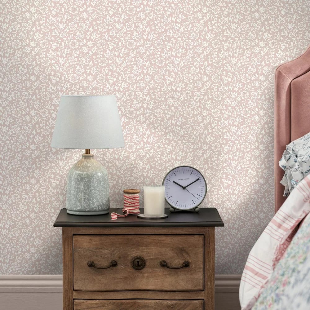
Say pink wallpaper and a lot of people picture a child's bedroom. Blush is a different thing. It is pink with the volume turned down, a soft chalky tone that sits closer to plaster or oatmeal than to bubblegum. On the wall it reads as a warm neutral, and that is why it works in a grown-up living room or a hallway just as well as a nursery.
What we mean by blush
There is a wide gap between a soft plaster pink and a hot coral, and the two behave very differently on a wall. Blush has grey or clay in it, so it stays quiet. Coral and rose have more red, so they push forward and want attention. Both have their place, but if you are after the calm, easy-to-live-with end of pink, you want the plaster tones.
Laura Ashley's Sweet Alyssum in Plaster Pink is a good marker for the soft end. It is a monoprint of small potentilla-like sprigs redrawn from the archive, on a soft pink ground, with a 62.4cm straight repeat. Priory and Kate, both in Coral Pink, sit at the warmer, more saturated end of the same brand. Same colour family, two quite different moods.
Why blush lifts a room
Blush is a warm pigment, so it does the same job as ochre or terracotta in a room short on natural light. In a north-facing room, where the light is cool and steady, a warm ground stops the walls going flat and grey. We have written about this in more detail in our guide to choosing wallpaper for a north-facing room, and blush belongs on that list of warm papers alongside the deeper tones.
It also flatters skin and warms up daylight, which is why it earns its keep in bedrooms and sitting rooms where you spend evenings. Under a warm 2700K bulb it glows rather than glares. Under a cold white bulb it can look chalky, so it is worth checking your bulbs as well as your paper.
Blush without the florals
Pink does not have to mean flowers. If you want the colour but not the pattern, a textured plain does the work. Laura Ashley's Brindley in Plaster Pink is a plain with a woven texture and a 64cm offset repeat, made as an alternative to paint when you want that flat four-wall look with a bit more depth than emulsion gives. Redbrook Wood Panel in Blush takes the panelled-wall effect and puts it in a soft pink, which reads fresh and contemporary rather than country.
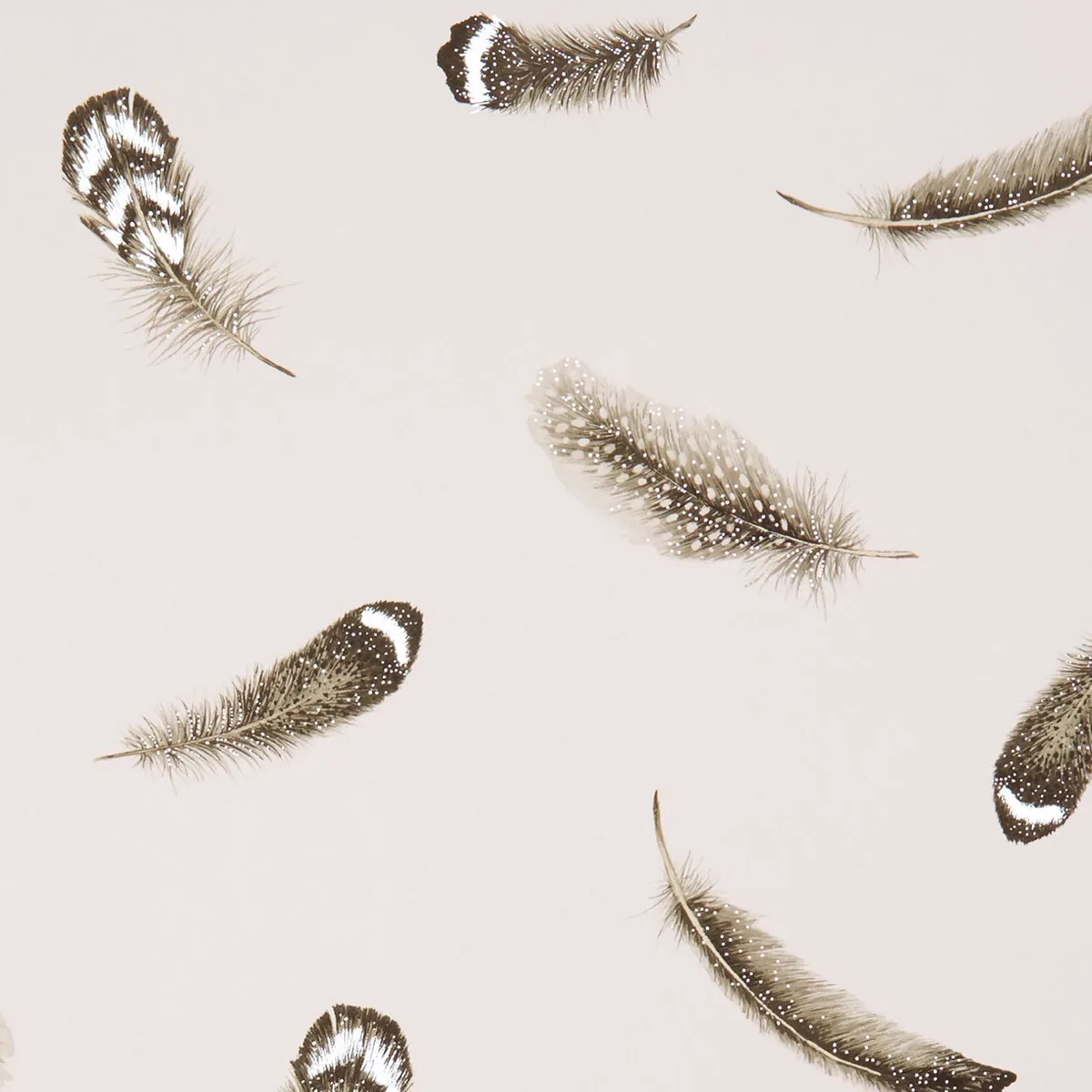
For something with a little shine, Clarke & Clarke's Plumis, from the Botanica collection, is a soft feather design that comes in a Blush and Gilver colourway. The gilver is a muted metallic, so it catches the light without turning the wall glittery. It is non-woven and paste-the-wall, with a 52cm offset repeat. This is blush behaving like a texture rather than a print.
Blush florals worth knowing
If you do want the flowers, there is plenty of choice at the soft end. Cath Kidston's Rose Flutter in Pink is a hand-painted design of baby-pink and soft-red rose vines with pale blue frills, all on a light blush ground, with a 42.66cm straight repeat. Garden Rose Autumn, also Cath Kidston, is a vintage country-garden floral in light-to-mid pinks lifted with pale gold, in a matt, spongeable finish with a 36.1cm offset repeat. Both are the sort of paper that looks charming on a chimney breast without taking over the whole room.
Our Cath Kidston and Laura Ashley papers are mostly £46 to £52 a roll, and nearly all of them are paste-the-wall, which makes hanging quicker and stripping easier down the line. You can see the full soft-pink range on the shop-by-colour page for blush wallpaper.
What blush pairs with
Blush is friendly with a lot of colours, which is part of why it earns the neutral label. Pair it with sage green for a soft, botanical scheme, the kind of restful pairing we go into in our guide to sage green wallpaper. Set it against ink or deep navy woodwork and it turns sharper and more considered. Bring in brass or aged-gold fittings and the warmth in the pink comes forward. If you want a blush floral to feel less sweet, hang it in a room with plain dark joinery rather than white, and it grows up fast.
One practical note before you order
Some of these papers have a long pattern repeat. Sweet Alyssum is 62.4cm, Brindley and Redbrook are 64cm. A longer repeat means more waste per roll, because you lose a strip at the top of each drop to line the pattern up. It is worth measuring properly before you buy so you order enough from a single batch, and our guide on how much wallpaper you need walks through the maths for exactly this. The product pages list the repeat and match type next to the price, so you can factor the waste in before you commit.
Blush is one of those colours that quietly makes a room feel warmer and calmer without shouting about it. If you want to see how the pinks read across plains, florals and textures, the full wallpaper range has large room-set and detail photos, with the pattern-repeat figures listed on every design.