Editorial
Dark Japandi: the calm, moody look defining 2026
- #trends
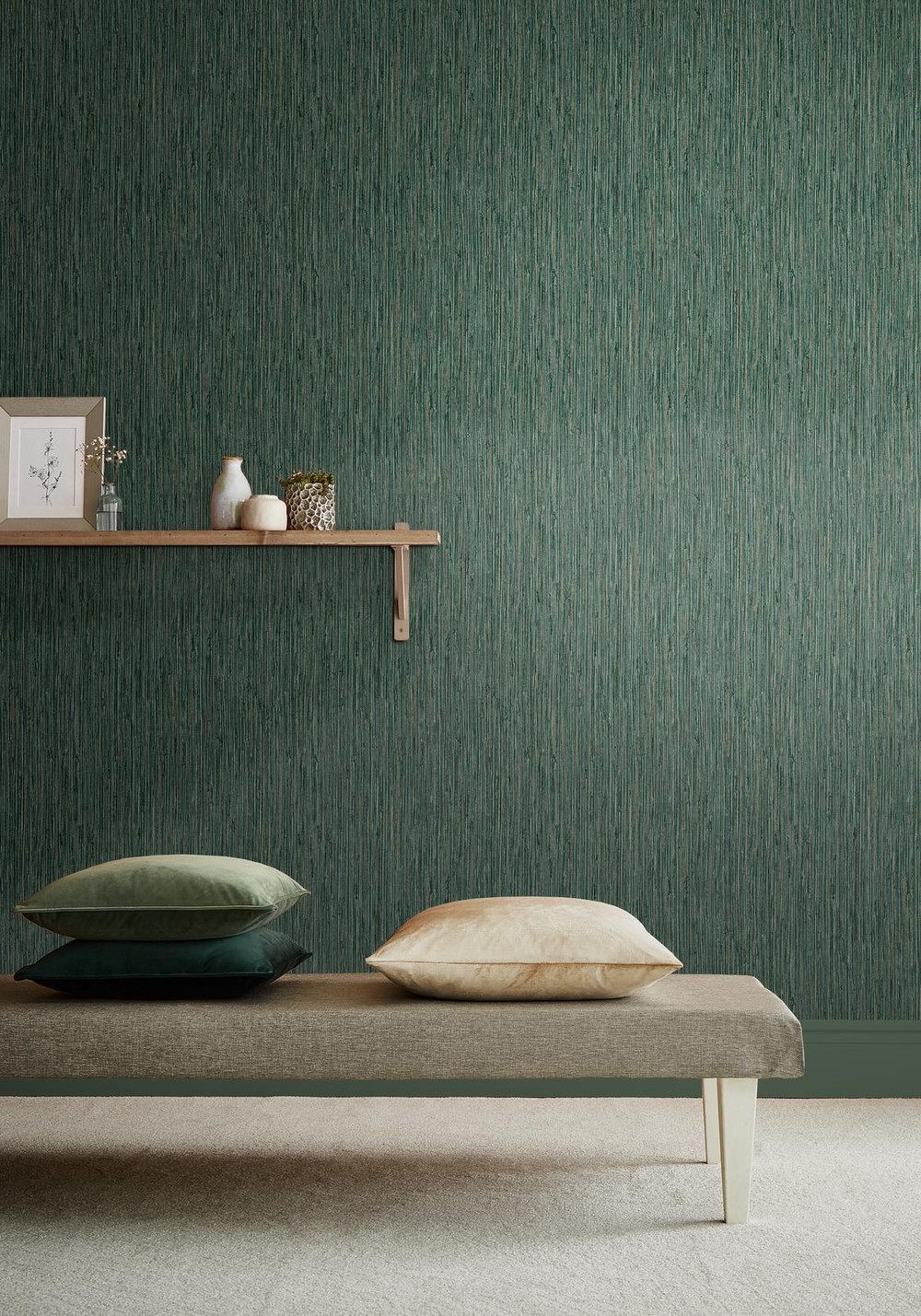
Japandi started as a pale, airy thing: bone walls, light oak, a lot of empty space. The 2026 version has turned the lights down. The same restraint is there, the same love of natural materials and clean lines, but the colour has moved from chalk to ink. Dark japandi keeps a room calm without keeping it cold, and it suits a north-facing snug or a small bedroom far better than the bright original ever did. Here is what the look actually is, and how to build it with one considered wallpaper rather than a full refit.
What japandi is, in one paragraph
Japandi is the meeting point of Japanese minimalism and Scandinavian comfort. From Japan it takes wabi-sabi, the idea that something a little imperfect and handmade is more beautiful than something flawless. From Scandinavia it takes hygge, the warmth of soft light, natural texture and a room you want to sit in. Put plainly, it is a quiet room with good materials and nothing shouting for attention. Dark japandi is that same idea with the wall colour dialled deep, so the whole space feels like dusk indoors.
Why it has gone darker for 2026
Two things are pulling japandi into deeper tones. People are leaning into the moody, cocooning rooms that have been building for a couple of years, and they have learned that a dark wall reads as restful, not gloomy, when the materials around it are warm. The pale version can feel a bit clinical in a British light, especially in the months when it barely gets bright all day. Swap the chalk wall for an ink or charcoal one and the wood, linen and brass suddenly glow. It is the difference between a room that looks empty and a room that feels still.
The colours that carry the look
Dark japandi is not one colour, it is a narrow family of them. The wall sits in the deep range and everything else stays soft and natural so the room never tips into heavy. A useful palette to work from:
Ink and charcoal for the main walls, the moody base the whole scheme rests on.
Warm wood tones, oak and walnut, to stop the dark reading as cold.
Muted greens like sage, used sparingly, for a living, organic note.
Soft clay, oatmeal and unbleached linen for cushions, throws and shades.
A whisper of brass or aged bronze in a lamp or a handle, never chrome.
If you want to see those deep tones together, our ink and sage shades are grouped in the shop by colour, so you can browse the base before you pick a pattern.
Why wallpaper beats flat paint here
You can do dark japandi with a flat painted wall, but a wallpaper earns its place because it adds the one thing minimalism still wants: texture. The trick is to keep the pattern quiet. Think of the paper as a surface, not a statement.
Three kinds of design work best. A grasscloth or woven-effect paper gives you real, tactile texture in a deep colour and is the most authentically japandi choice. A fine organic line, a slim branch, a reed, a soft botanical drawn in a tone close to the background, nods to the Japanese side without becoming busy. A subtle plaster or washed effect reads almost plain from across the room but stops a dark wall feeling like a void. What you are avoiding is a large, high-contrast repeat. A bold floral or a graphic geometric fights the calm, and calm is the whole point.
Two we keep coming back to for this look are Grasscloth Texture, for real woven depth, and Herringbone Texture, for a quieter weave. Both read as surface rather than pattern, which is exactly what this look wants. Open either product page and study the close-up and room-set photos to see how the weave sits against wood and linen before you buy the rolls.
Where it works in the house
A dark wall does not shrink a room the way people fear. In a small space it does the opposite: it blurs the edges so you stop reading where the walls stop, and the room feels deeper and more enveloping. That makes dark japandi a good fit for a bedroom, where you want the light low and the mood settled, and for a north-facing or low-light snug that was never going to be bright anyway, so you may as well lean into the dusk. A hallway papered this way feels like a considered pause rather than a dim corridor. The one place to think twice is a room you need to feel busy and awake in, like a home office that already lacks daylight.
Lighting makes or breaks it
Dark walls eat light, so a single bright ceiling bulb is the enemy. Layer it instead. A couple of table or floor lamps with warm bulbs, around 2700K, pool light at low level and let the wall fall away into shadow at the top. That pooled, lived-in light is what makes the deep colour feel cosy rather than cave-like. It is also why the same paper can look wonderful in one home and flat in another: the lighting is doing half the work.
Judge a deep colour before you commit
Deep colours are the ones people misjudge most often, because a dark paper looks one way under a shop light and another in a real room at dusk. This is where the product pages earn their keep. Open the large, zoomable detail photos and the room-set images, and you can read the depth of the colour and the texture of the weave far more honestly than a small thumbnail allows. Look at how the paper sits against wood and linen in the room shots, and check the pattern-repeat figure listed on each product so you know exactly how the design will tile across a feature wall.
When you are ready to start looking, browse the full wallpaper collection and filter down to the deep ink tones or the quieter japandi-leaning styles. Pick the one that feels most like a surface and least like a pattern, study its detail and room-set photos closely, and check the listed pattern repeat before you decide.