Editorial
Oxblood, ochre and ink: using deep colour on your walls
- #trends
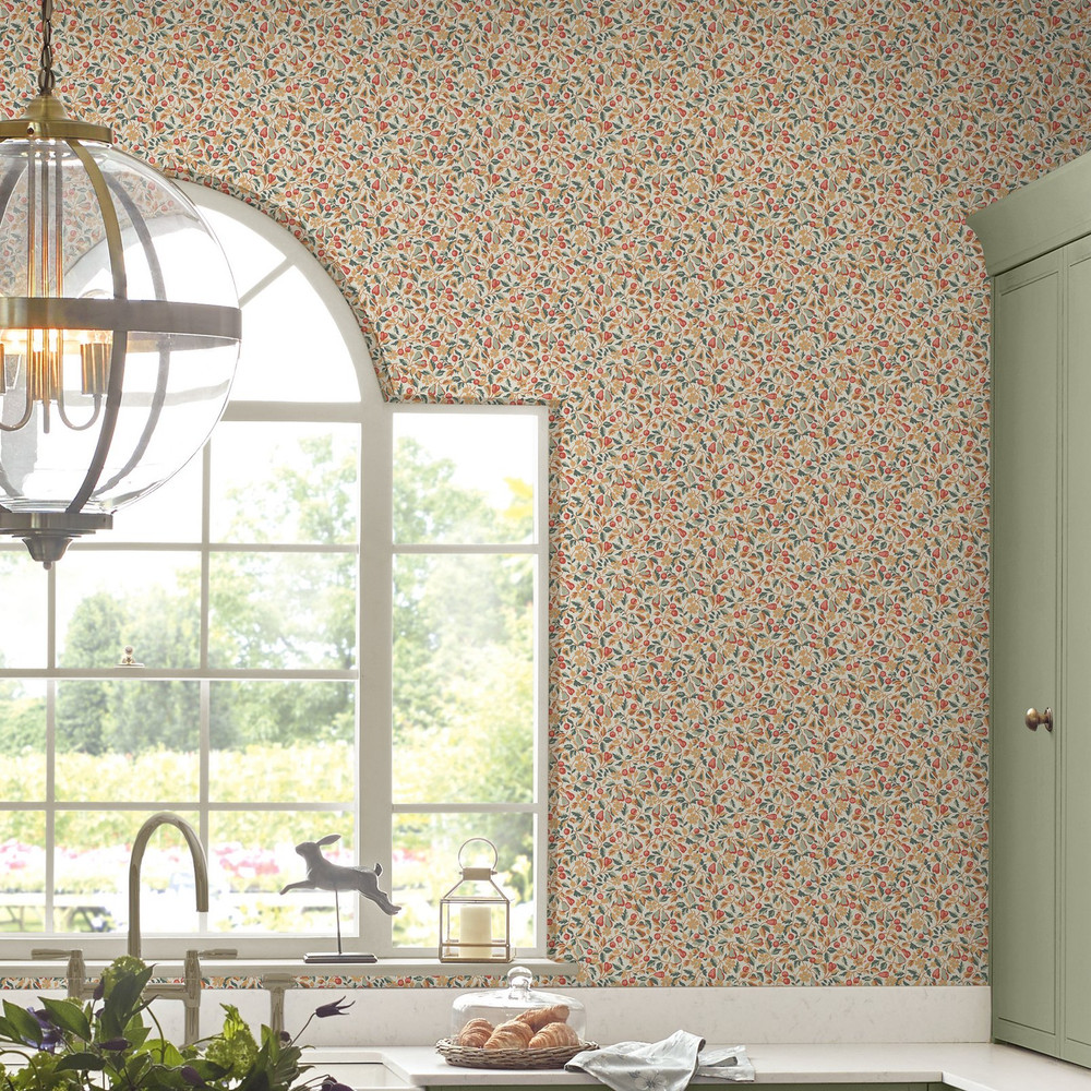
Deep colour scares people more than it should. The worry is always the same: won't a dark wall make the room feel smaller, gloomier, harder to live with? In practice the opposite tends to happen. A saturated wallpaper wraps a room rather than shrinking it, and the corners stop announcing themselves once the colour carries past them. Oxblood, ochre and ink are three of the colours we get asked about most, and each behaves differently once it's up. Here's what to expect from them, and where each one tends to work best.
Oxblood: warmth with a bit of weight
Oxblood is a deep, brownish red, the colour of an old leather chair or a glass of claret held to the light. It reads as warm without tipping into the brightness of a true red, which is what makes it so easy to live with. In a north-facing room it does the job natural light won't, giving the walls a glow on the dullest Hull afternoon. In a south-facing room it deepens and softens as the day goes on. We've hung oxblood wallpaper in dining rooms and snugs more than anywhere else, because it suits a room you use in the evening, by lamplight, with the curtains drawn. A damask or a dense floral in oxblood feels considered rather than loud. Pair it with brass, warm timber and cream woodwork and the room settles.
Ochre: the colour that acts like sunlight
Ochre is a warm, earthy yellow with a touch of brown in it, closer to mustard than to lemon. It's the most forgiving of the three, because it lifts a room the moment it goes up. A wall in ochre can stand in for the light a room hasn't got, which is why it works so well in hallways, box rooms and any space that faces away from the sun. It's also sociable. Ochre sits happily next to sage green, soft blush and the deeper end of the palette, so you can build a whole scheme around it without much risk. The one thing to watch is undertone. A mustard ochre with a green lean and a golden ochre with a red lean behave very differently on the wall, so look at the pattern in the actual room before you settle on one.
Ink: the quiet drama
Ink is a deep blue-black, a near-navy that never quite reads as black. It's the most dramatic of the three and, oddly, often the easiest to commit to, because it acts almost like a neutral. A wall in ink gives you a backdrop that makes everything in front of it look better. Pale art pops against it. Brass and gold warm it up. Greenery reads brighter. Ink suits bedrooms especially well, because the depth makes the room feel calm and enclosed in a way that helps you sleep. It's also the colour behind the dark, moody looks doing the rounds in 2026. A botanical or a fine geometric on an ink ground gives you all the depth without the flat heaviness of a plain dark paint.
Why a deep colour in pattern beats a deep colour in paint
A wall painted a single dark shade can fall flat, especially in poor light, because there's nothing for the eye to catch. Pattern fixes that. A damask, a trailing floral or a small repeat in the same deep colour gives the wall movement and a change of tone across its surface, so the colour stays alive as the light shifts through the day. It also hides a multitude of sins. Dark paint shows every roller mark, scuff and patched bit of plaster, whereas a patterned paper forgives an imperfect wall and keeps looking good for longer. If you've been nervous about a flat block of strong colour, pattern is the lower-risk way in.
How to use deep colour without overdoing it
Start with the room you use in the evening. Dining rooms, snugs and bedrooms take deep colour more naturally than a bright kitchen does.
Let the colour run round the whole room rather than stopping at one feature wall. A single dark wall facing three pale ones often looks like an afterthought.
Keep the woodwork warm. Cream or soft stone skirting flatters oxblood and ochre, while ink can take a crisper white or a tone close to the paper itself.
Bring in metal and timber. Brass, aged gold and warm wood stop a deep scheme feeling cold.
Mind the lighting. Deep colour drinks light, so a room papered dark wants more lamps and warmer bulbs than a pale one.
Seeing the colour properly before you commit
Deep colour is the hardest kind to judge from a phone screen, because screens brighten and cool everything. The best way to get a true read is to look closely at the large detail photos and room-set images in the wallpaper range, where you can see how the pigment behaves across a whole wall and next to furniture, rather than as a flat block on a screen. Check the pattern-repeat figure on each product too, because a deep colour in a large repeat reads very differently from the same colour in a tight one, and the repeat tells you how the design will tile across the room. Spend a little time with the detail before you decide, and a deep colour stops being a gamble and starts being the easiest choice you'll make for the room.