Editorial
Wallpaper for a dark room with no natural light
- #advice
- #rooms

A dark room is a different problem from a dim one. A north-facing room at least gets steady daylight. A proper dark room, an internal box room, a basement, a hallway with no window, a bedroom tucked under a shaded gable, gets almost none. The paper you put on those walls can't borrow warmth from the sun, because there isn't any to borrow. So it has to bring its own. That changes what works, and it rules a couple of popular choices straight out.
Decide first: lift it or lean in
There are two honest ways to handle a dark room, and they pull in opposite directions. You can lift it, using pale, warm, light-reflecting paper to make the most of every lamp and bulb. Or you can lean in, going deliberately deep and moody so the room reads as cosy rather than gloomy. Both work. What tends to fail is the middle: a flat mid-grey or a cool taupe that looked fine with plenty of light and has none now. Pick a direction before you pick a paper.
If you want to lift it
Start by ruling out cool greys and stark brilliant whites. People reach for white to brighten a dark room and it backfires. With no daylight to keep it crisp, a cool white goes dull and faintly grey, and a cool grey goes the colour of a wet pavement. Warm grounds do the opposite. A soft cream, a warm stone, a putty with a pink or yellow lean holds its warmth under lamplight and keeps the room from feeling cold.
Then let the pattern carry some light. A design with metallic or mica in it genuinely helps, because it catches what little light there is and throws it back. Clarke & Clarke's Selva is a good example: a gold-toned jungle leaf on a light ground with a faint metallic strain, so it shifts and glints as you move a lamp past it. Small, open florals on a pale ground do a similar job, giving the eye some movement without darkening the wall. You'll find warm grounds and florals across the wallpaper range, with room-set photos that show how each one behaves off a single lamp.
If you want to lean in
The other route is to stop fighting it. A room that never gets sun is the one room where a deep, dark paper makes complete sense, because you're not asking it to do something the light won't allow. Ink blue, forest green, oxblood and near-black read as enveloping in a small dark space rather than heavy. It's the trick behind a good downstairs loo or a snug: the dark walls turn a lack of light into the whole point of the room.
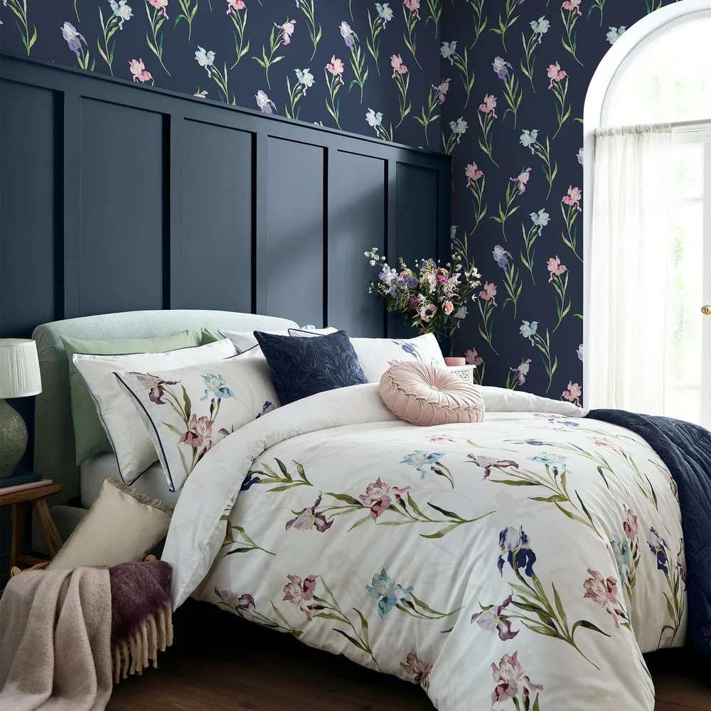
A dark floral keeps that look from turning flat. Laura Ashley's Hawling Irises in Midnight Seaspray, a watercolour iris trail on a deep ground, is the sort of paper that suits a windowless dining room or a box bedroom where you'd have a lamp or a candle on anyway. If the deep end appeals, the ink and deep-colour papers are grouped together so you can see them as a set.
Sheen does more than colour here
In a bright room, finish is a detail. In a dark room, it's half the decision. A dead-matt paper drinks light, so a matt dark wall can tip from moody into murky. A finish with a slight sheen, a mica ground, a subtle metallic, or just a smooth printed surface, bounces your artificial light around instead of swallowing it. If you're going dark, a touch of sheen keeps the room feeling alive after sunset. If you're going pale, a smooth finish reflects more than a chalky one does.
Fix the lighting while you're at it
Paper can only give back the light you put in front of it, so a dark room is a lighting job as much as a paper job. One central bulb makes any colour look worse. Layered lamps at different heights, a warm bulb around 2700K, and light aimed at the papered wall rather than the floor all change how the pattern reads. A warm-white LED flatters a warm paper. A cold daylight bulb greys it straight back down. It's worth sorting the bulbs before you judge the paper.
The small dark box room
Most dark rooms are also small, which tempts people into tiny, timid pattern. You don't have to. A bigger, confident pattern can make a box room feel considered rather than cramped, as long as the repeat suits the wall. Check the pattern repeat before you buy, because a 52cm repeat behaves very differently on a narrow chimney breast than a metre-long one. The product pages list the repeat in centimetres for exactly this reason.
Whichever way you go, the thing that settles it is seeing the paper on a wall, in real light, at the size it's actually printed. Every design in the wallpaper range has room-set photos and its pattern repeat listed, so you can judge how a warm floral lifts a gloomy corner, or how a deep ink ground turns a windowless room into the cosiest one in the house.